Superdisco
Project overview
Superdisco is a hip hop nightclub in Rotterdam that, until this project,
didn’t have a website. They relied completely on Instagram to promote
events, share ticket links, and post photos. For visitors, this meant
scrolling through feeds to find details, sometimes missing tickets or
seeing outdated posts. For the club, it made them look less professional
and caused messy communication: DMs about lost items or business inquiries
got mixed up with event promotion.
They needed a central hub that felt professional, where events and tickets
were easy to find, photos could be browsed, and business communication
moved out of DMs into proper email. Thus making a website the proper
solution.
Defines
The project started with clear needs:
Showing all the upcoming events
Able to buy ticket
A photo gallery of recent nights
Able to contact
Because these features were limited, I scoped the site down to a single page so visitors could find everything quickly
Exploration and Direction
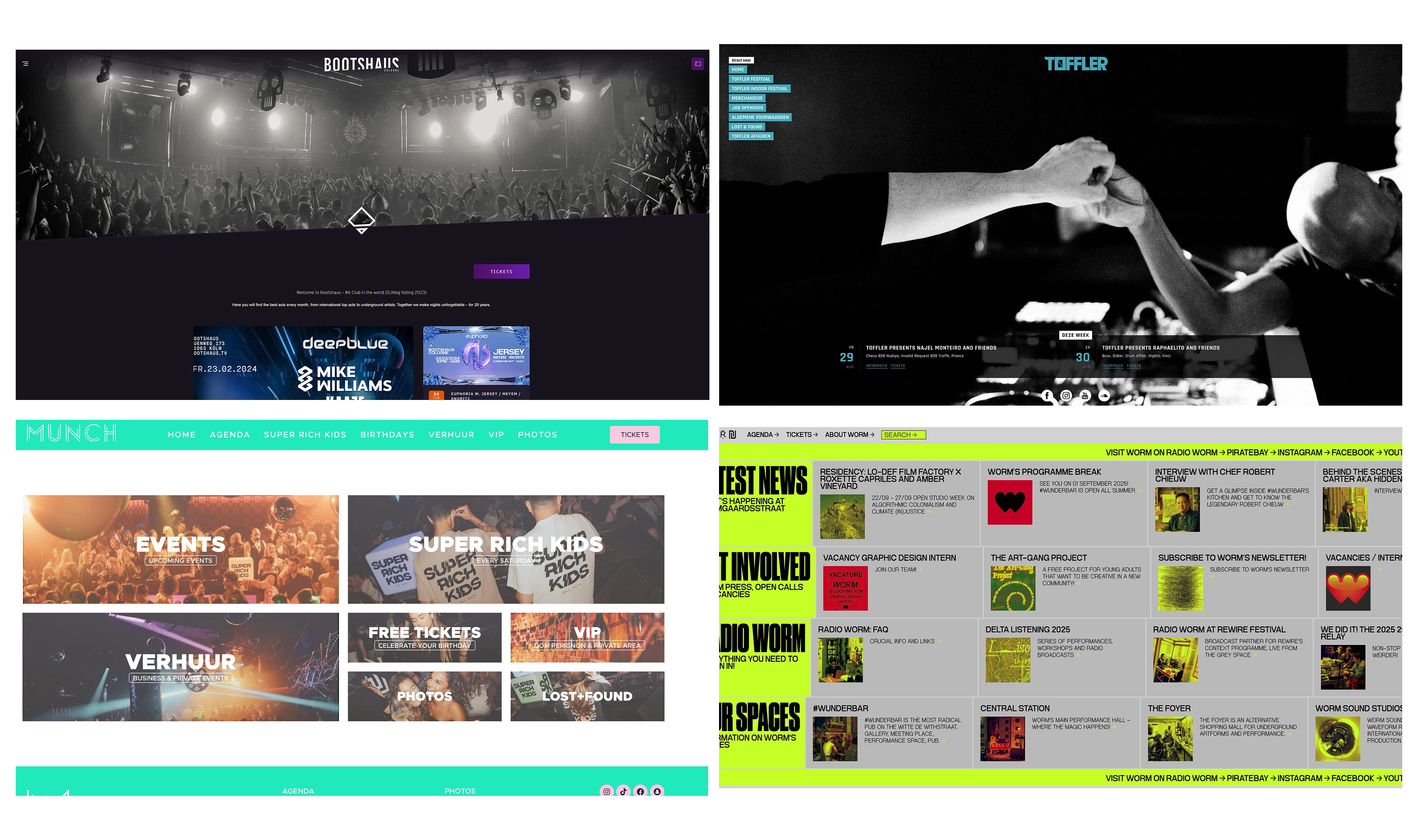
I researched competitor websites to look for patterns and inspiration. Most of them felt flat, uninspired and very static. I wanted Superdisco to stand out and reflect the vibe of their hip hop events, so I planned for bold visuals and subtle animations.
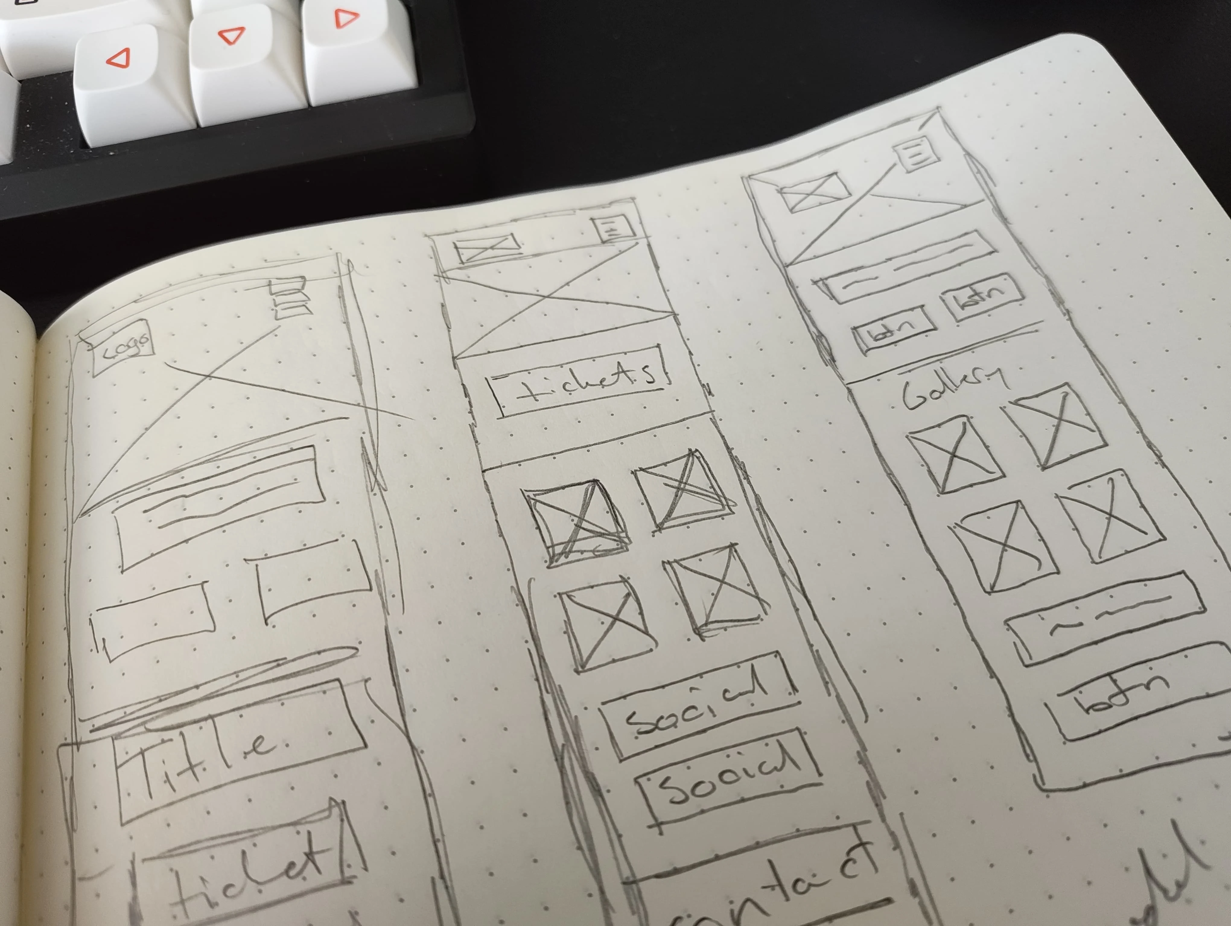
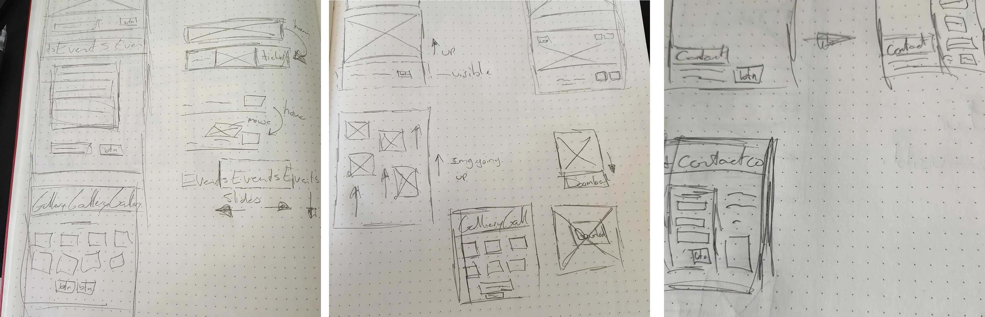
Brainstorming & Prototyping
I created sketches for my own brainstorming, created prototypes in Figma and iterated the page layout. As the users are mostly from instagram, I decided to go for mobile-first design.
Visual direction
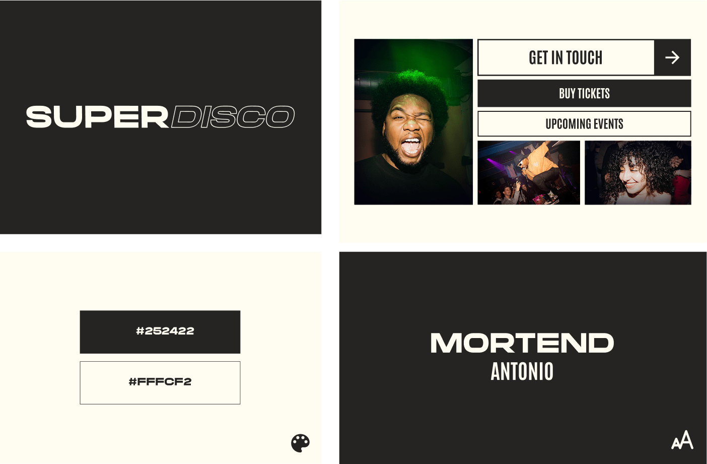
To start off, I went with a dark theme to match the nightlife vibe. I wanted enough contrast between elements, so it not only feels like nightlife but also stays readable on any device. Text was set at a minimum of 16px for accessibility on mobile, and I used the Mortend font since it was based on their logo, keeping the design consistent with their brand.
Animations
For animation, I kept it minimal. My first idea was to have the header video scale and cycle from big to small while scrolling, while iterating and figuring out the animations deeper in the process, I decided to remove it, as it was way too much of movements at the header and it had an impact on performance of the website. So I decided to remove it and keep it static.
Prototyping
I used Figma for wireframes, prototypes, and design. I iterated on layouts and shared them with the client for feedback. Because their audience comes mostly from Instagram, I designed everything mobile-first so event info, tickets, and galleries could be accessed right away without scrolling endlessly.
Content Management
The staff needed the possibilities to add upcoming events and photo albums.I set up Sanity CMS so the team could add events (title, date, image, ticket link) and upload albums for each night. Everything updates automatically, no coding needed for the team.
The client determined a short development time, so, because of that I chose Sanity for the CMS. It was quick to set up and customizable, flexible for handling both events and photo galleries. I also created short tutorial videos to help the team remember how to use it, if they ever forgot certain functions.
Impact
The website gave Superdisco a professional platform beyond Instagram, strengthening their credibility and expanding their reach.
- Easy access to upcoming events and tickets
- Mobile-friendly galleries to relive past nights
- Clearer communication, with lost items and business handled via email
- Full control of events and galleries via CMS
- Tutorial videos helped them publish new content independently
- A steady flow of inquiries now comes through the website instead of messy DMs
The Superdisco team was happy to finally have a site that matched their energy and gave them independence.
Takeaways
This project showed me how much value even a small, focused site can deliver. The right design and CMS setup gave the club something they were missing.
One key takeaway was about CMS choice. Sanity was the right fit at the time because of the short development timeline and good documentation of the CMS itself. But the project also pushed me to research alternatives, and today I’d consider Statamic for its ready-to-use functionalities.
Another lesson was about balance: strong visuals and animation can bring energy, but performance and usability always come first, especially for a mobile-first audience.